Healthcare cost
How much American people paied for their healthcare, and who paid? Visualization of data from CMS will give you a general idea.
This is an assignment of my data visualization class. The professor want students to give an overview of the dataset from CMS (https://www.cms.gov/Research-Statistics-Data-and-Systems/Statistics-Trends-and-Reports/NationalHealthExpendData/Age-and-Gender.html).
The dashboard I made was shown bellow.
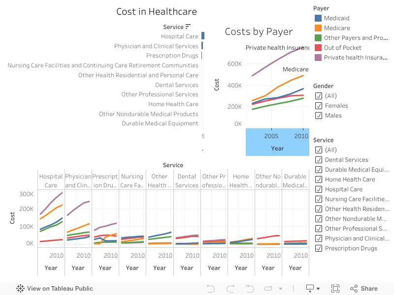
The dashboard is consisted with three graphs. It provide an overview of the dataset provided:
- The health cost is increasing;
- Hospital care, physician and clinical service, and prescription drugs are three major cost of services;
- Private health insurance and Medicare are the major payers.
Shneiderman's mantras priciple.
- Overview first: cost by service and cost by payer on the top of the dashboard.
- Zoom and filter: the bottom graph give a detailed cost by payer and service along years.
- Details on demands: if the user want to know specific cost, the gender filter and service filter on the right can be used.
I used the sampe color code across the dashbord, and filter and highlight are also across the dashboard. I also sort the bottom graph according to cost descending, so that the services which cost most on the most left side to get the attention of users.
Hope you like this dashboard.